Mine Ops Shift Report

UX Research
Product design

Project Overview

A data-driven shift performance platform that links operational variance to structured explanations, enabling accountability, cross-shift clarity, and leadership visibility

Role & duration

Senior UX Designer. Conducted field research, defined interaction models, designed MVP features, ran evaluative + continuous research, and influenced post-release roadmap decisions.

Problems

  • Single-PC Excel bottleneck
  • Limited comment capacity
  • No traceability of authorship
  • No structured negative variance documentation
Excel shift report previosly used

Users & roles

Although the report was originally scoped for shift supervisors, it quickly became useful for multiple roles. We intentionally designed a unified interface (instead of role-specific UIs) to control build cost and complexity, relying on training and clarity rather than segmentation.
‍
Role
Primary Goal
Usage Pattern
Shift Supervisors
Document and explain performance
Throughout shift + end-of-shift
Senior Supervisors
Read explanations and prepare report for cross-over meeting
Throughout shift + end-of-shift
General Supervisors
Review historical reports
On demand
The Solution

Shift Performance Report

A collaborative platform built around one core idea: performance deviations should never exist without explanation.
‍
The interface is intentionally dense. Each row represents equipment, and each column reflects a key operational metric. At the center is the variance column, the behavioral trigger. When performance drops below target, supervisors are expected to explain why and document what action was taken.
‍

Data relationships

The system was intentionally designed to couple negative variance detection with mandatory contextual explanation. Variance wasn’t just displayed, it triggered documentation responsibility. This reinforced accountability and ensured that performance deviations were captured with reasoning, not left implicit.
Problem solving

Designing for data-dense monitoring

When a variance was negative (e.g., red cell), supervisors had to entered contextual explanations.
Solution
  • The interface hierarchy prioritized visibility of variance and associated comment fields.
  • The design supported accountability during shift handover meetings by making explanations easy to review.
Results
  • πŸ‘ Business Goal : 50% increase in the number of comments entered compared to previous Excel
β€œI don’t have to wait for people to be back on shift to get an explanation of a specific issue on a specific day.”
Mine General Supervisor

Trust in the system

Users were constantly guessing what data to trust, and were already used to not having any feedback mechinisms from their systems
Solution
To build trust, we made data freshness explicit (e.g., β€œLast Updated” labels) and added clear states for data issues. Users previously had no indication whether dashboards were functioning, visibility increased trust.

We also designed clear indicators for the different states the system could go through

Adjusting for small laptops

The original Excel had ~40 rows, many unused. We audited usage, removed underused sections, and reorganized the table around operational meaning. We also froze the first column (Equipment ID) and the final column (Comments) to match the intended scanning behavior.
Solution
In order to facilitate investigation, more metrics had to be included in order to reduce the need of supervisors to jump to other dashboards. We made sure the interface ajusted accordingly and users could see relevant information first.

Research & Validation

Discovery methods
  • Contextual inquiry at mine sites
  • Interviews
  • Workshops
  • Log analysis
Key findings
  • Collaboration was bottlenecked by single-PC Excel use
  • Reports lacked traceability
  • Context was lost due to limited comment capacity

Outcomes and impact

Tool adoption was much higher than initially expected. Managers mentioned how easy it was now to understand the reason behind bad performance without having to chase people, and supervisors loved they didn't have to wait in line to enter their reports.
‍
πŸ‘
+50%
Increase in comments created vs Excel
πŸ‘
+70%
Increase in comment creators vs Excel
πŸ‘
5 -> 40
Expected -> Active users

Challenges & decisions

Building trust from scratch. The site had worked with our team before but felt abandoned when leadership pulled back. That history made early research conversations difficult, users weren't initially interested in explaining their processes, they wanted to be heard. I adjusted. The first sessions were mostly listening, with occasional deeper questions nobody had asked them before: do you know where this data comes from? has anyone ever trained you on this? Those questions opened things up. Within a couple of sessions one key user was reachable directly on Teams anytime, no customer success intermediary needed. That access changed everything about the quality of research we could do.

‍Researching from a distance. The site was three hours away and supervisors were busy during shifts. Getting direct observation time was limited. I compensated with deep secondary research, internal documents, established process records, and telemetry data from their existing PowerBI reports. This meant that when I did get face time, conversations were immediately meaningful rather than introductory, which helped sustain the trust built early on.

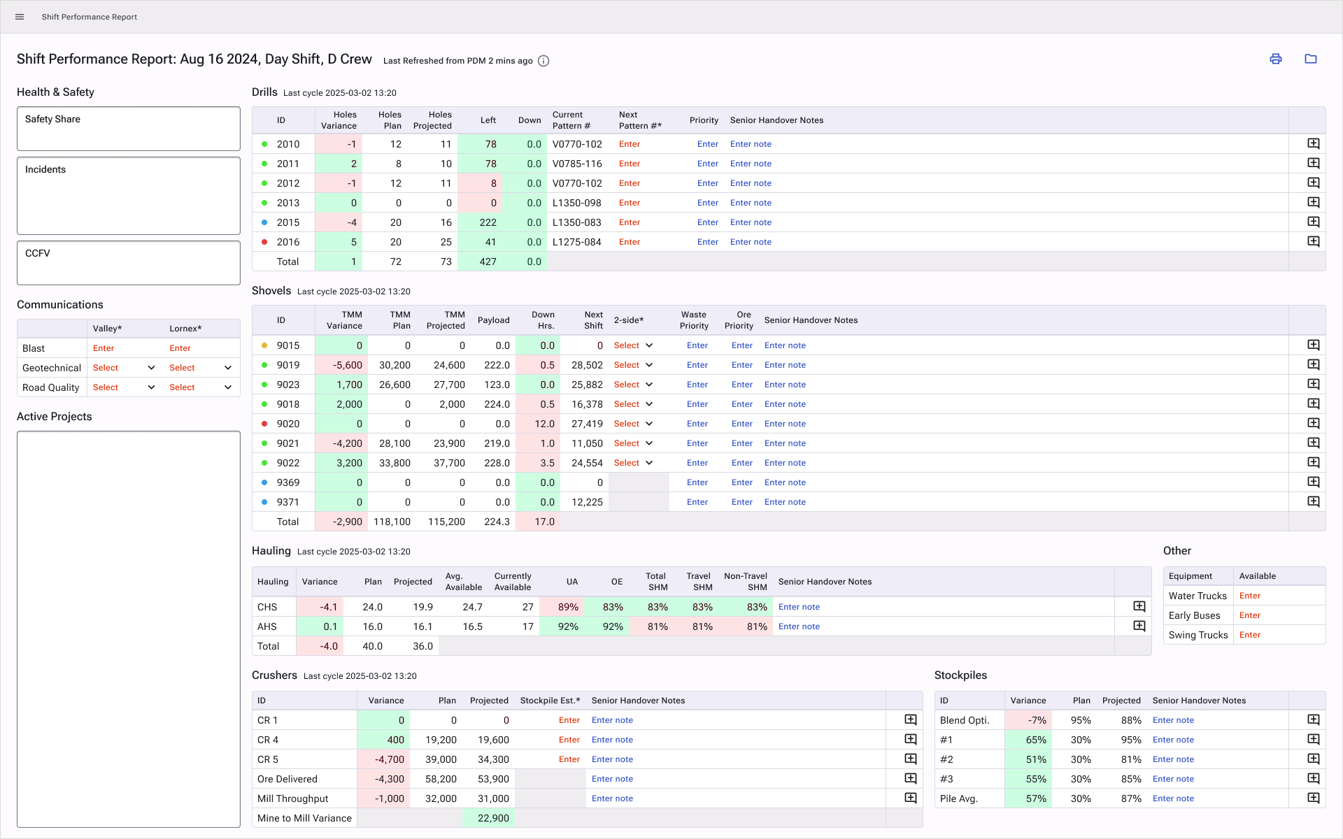
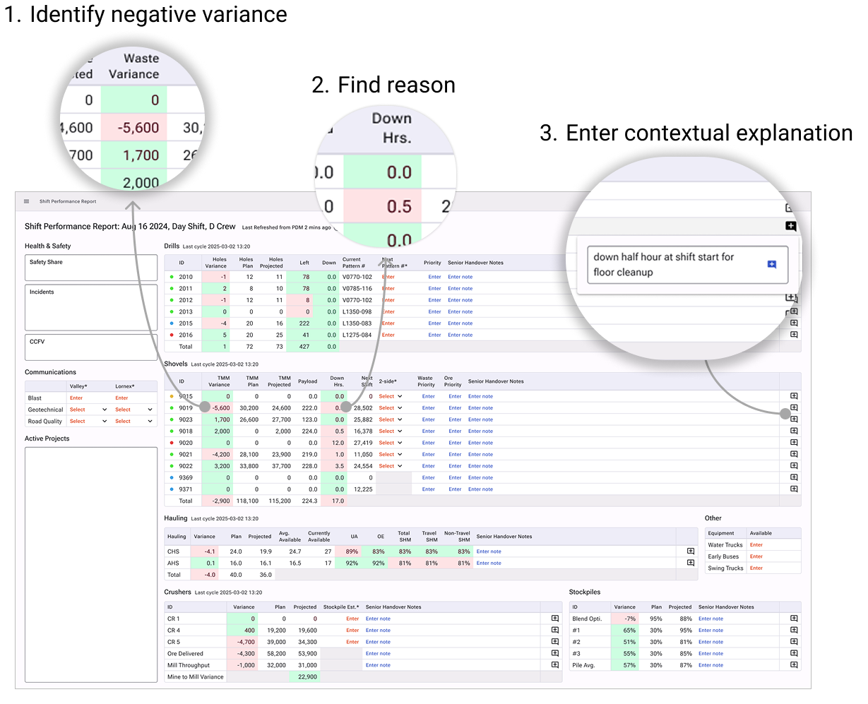
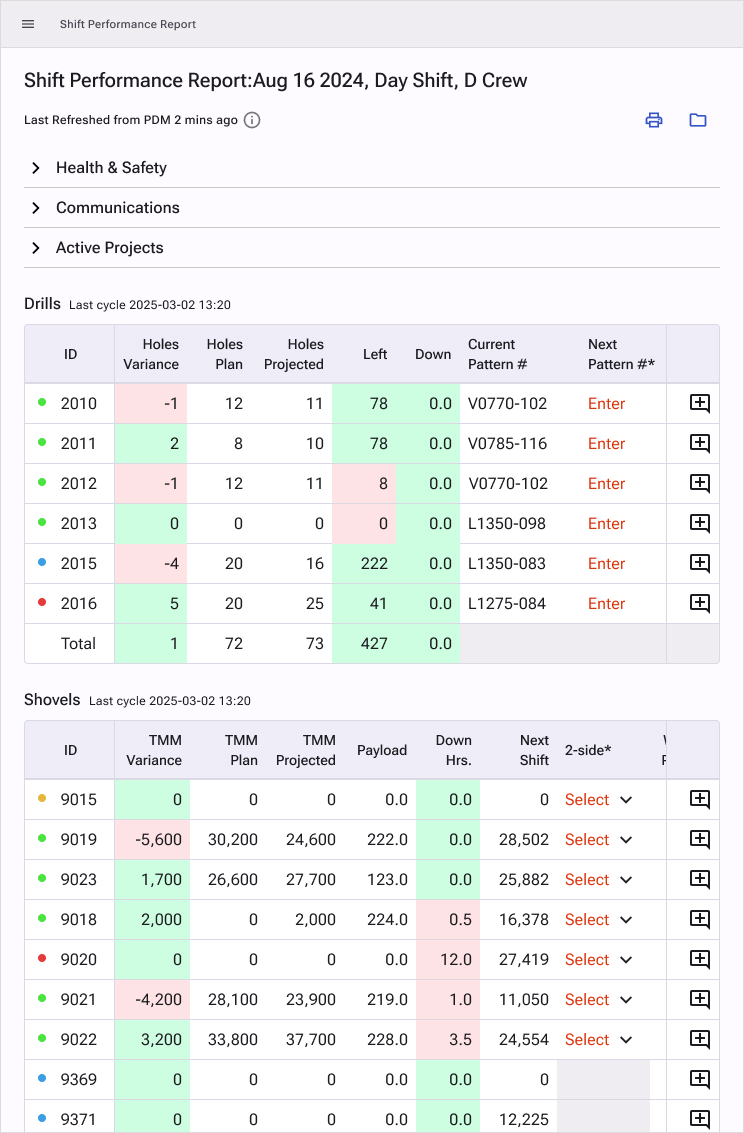
‍Pushing back on scope. After an early site visit, the team proposed building predictive production recommendations. I'd seen that kind of ambition compress badly under time pressure before. With three months total and a site that was still warming up to us, I argued for starting with the two biggest pain points I'd identified in research: report creation and performance monitoring. I also proposed keeping the design close to what supervisors already knew, to flatten the learning curve and improve adoption odds. The team went with report creation. Results exceeded expectations.

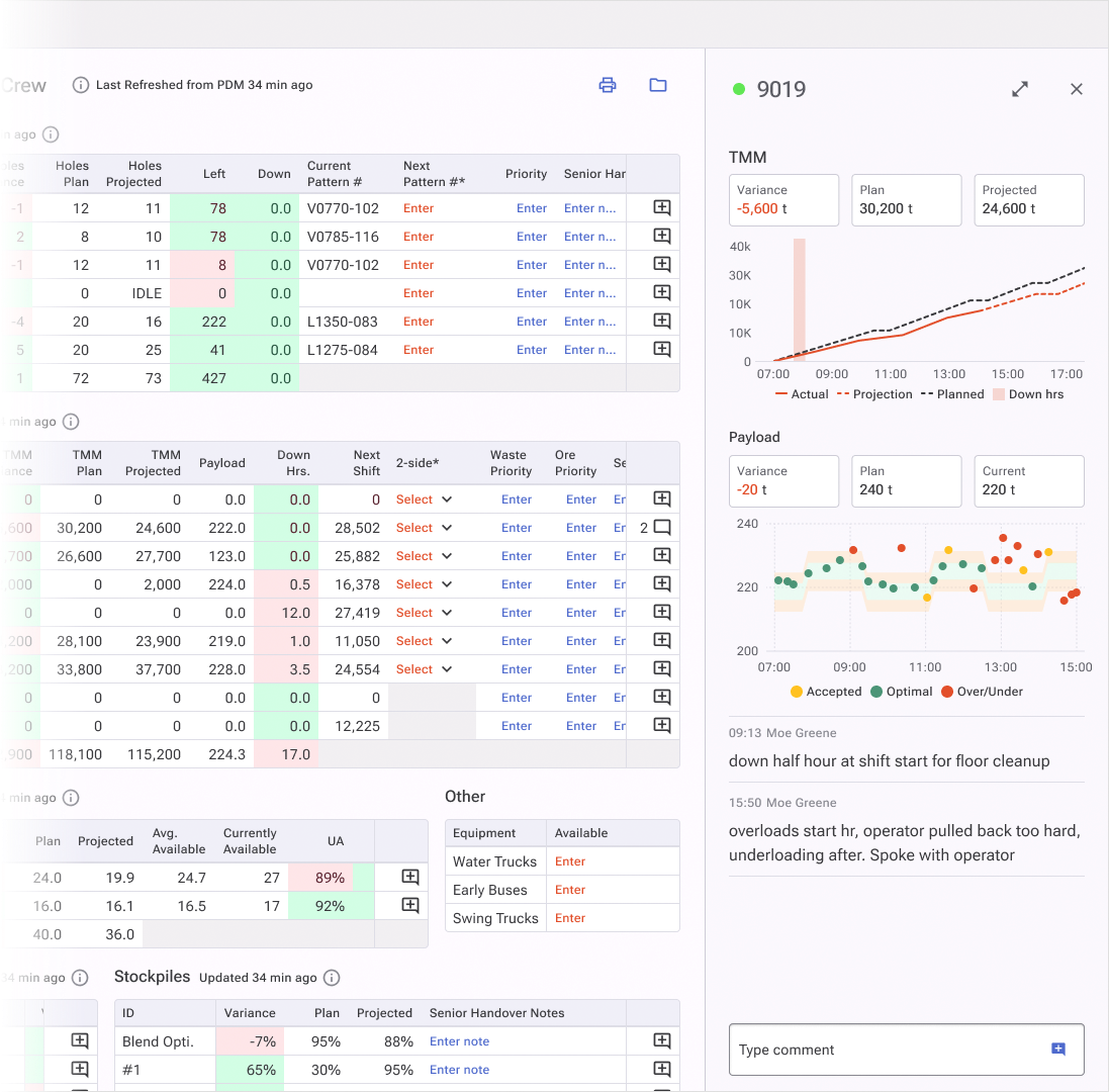
‍Negotiating the design system. Engineers wanted to use an existing UI framework to save time. I wanted to build something new. Time won, but I negotiated three conditions before agreeing: rebranding was non-negotiable (color and typography), I had approval rights on the framework choice (we landed on MUI for its depth of complex table support), and I retained the right to propose custom components where nothing available met user needs. A small number of low-complexity components were built. The rest was MUI.

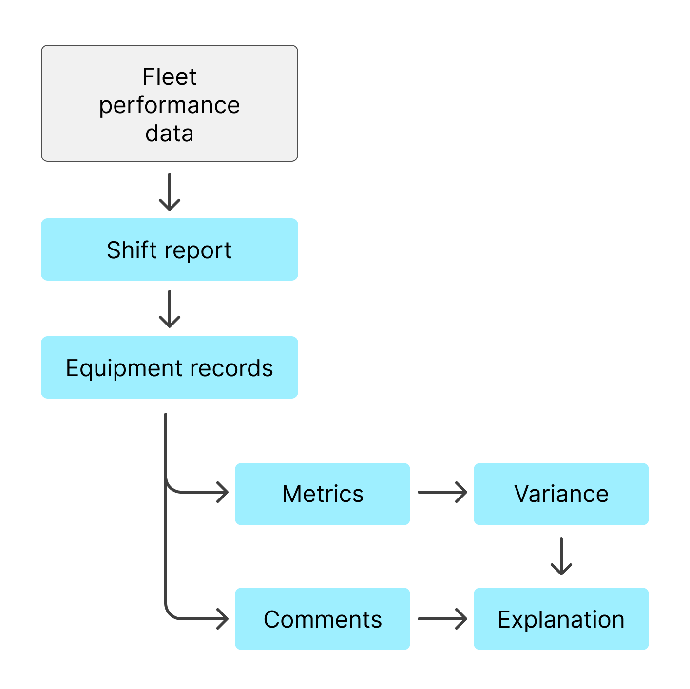
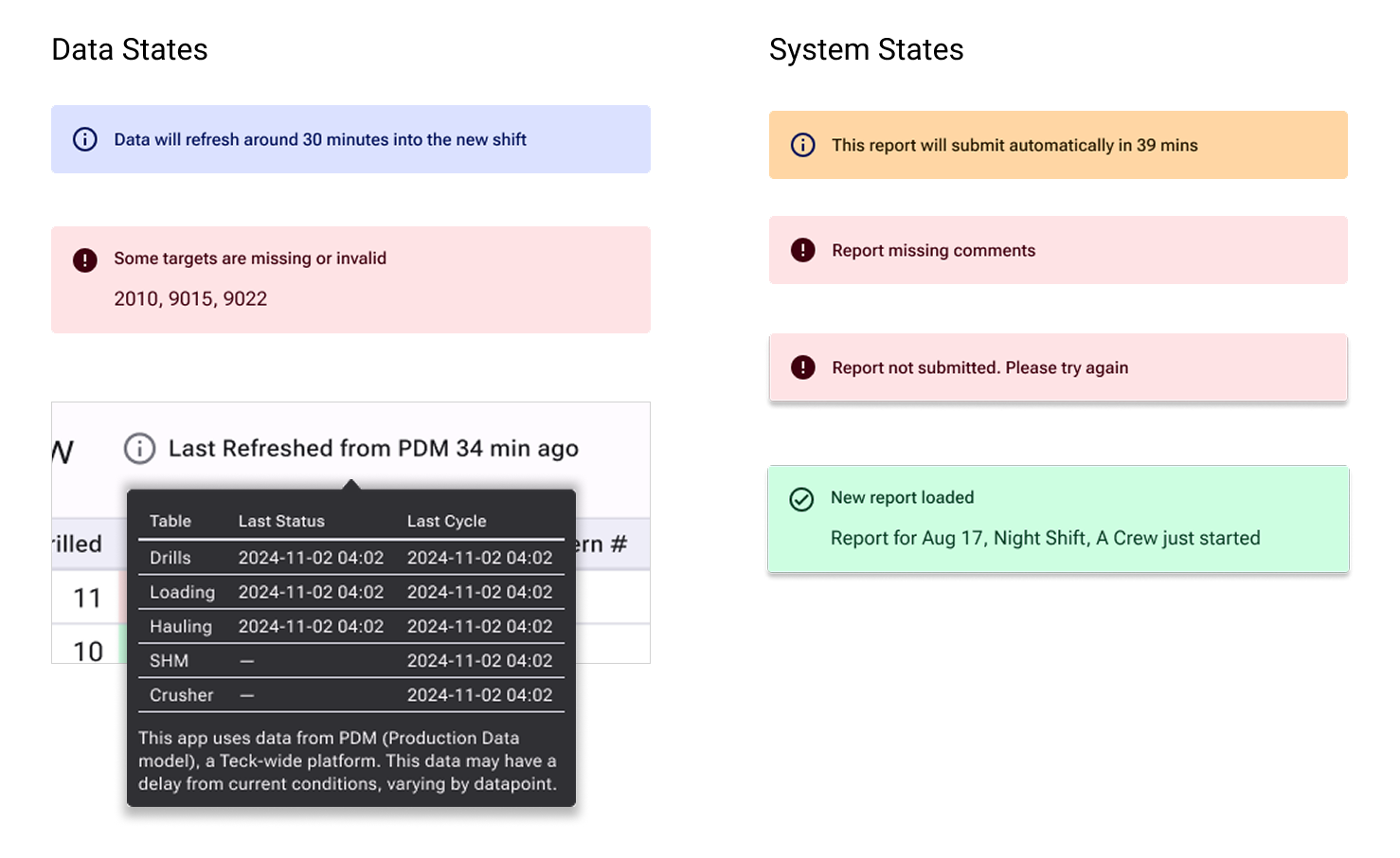
‍Owning validation when no one else would. There was no plan to monitor app performance post-launch, and the team was reluctant to prioritize it. I took ownership by asking for only a few hours of engineering time, I defined the exact events and metadata to track, then handled all the cleaning, analysis and reporting myself using Databricks and PowerBI. What started as a personal initiative became the source of truth for the whole team: customer success used it for site interactions, leadership used it for monthly performance reviews, and site managers used it to track comment compliance. I owned and maintained both reports, one for compliance visibility across the team, one for deeper event-track analysis for the product team only. Rather than over-engineering, we prioritized structured clarity and adoption first, then used telemetry to guide iteration.
‍
HomeMy work