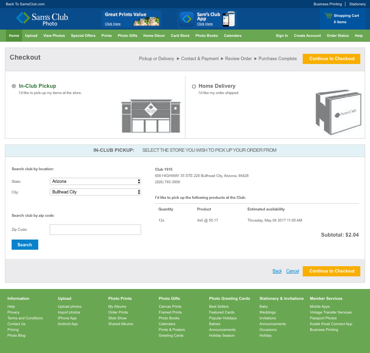
Process
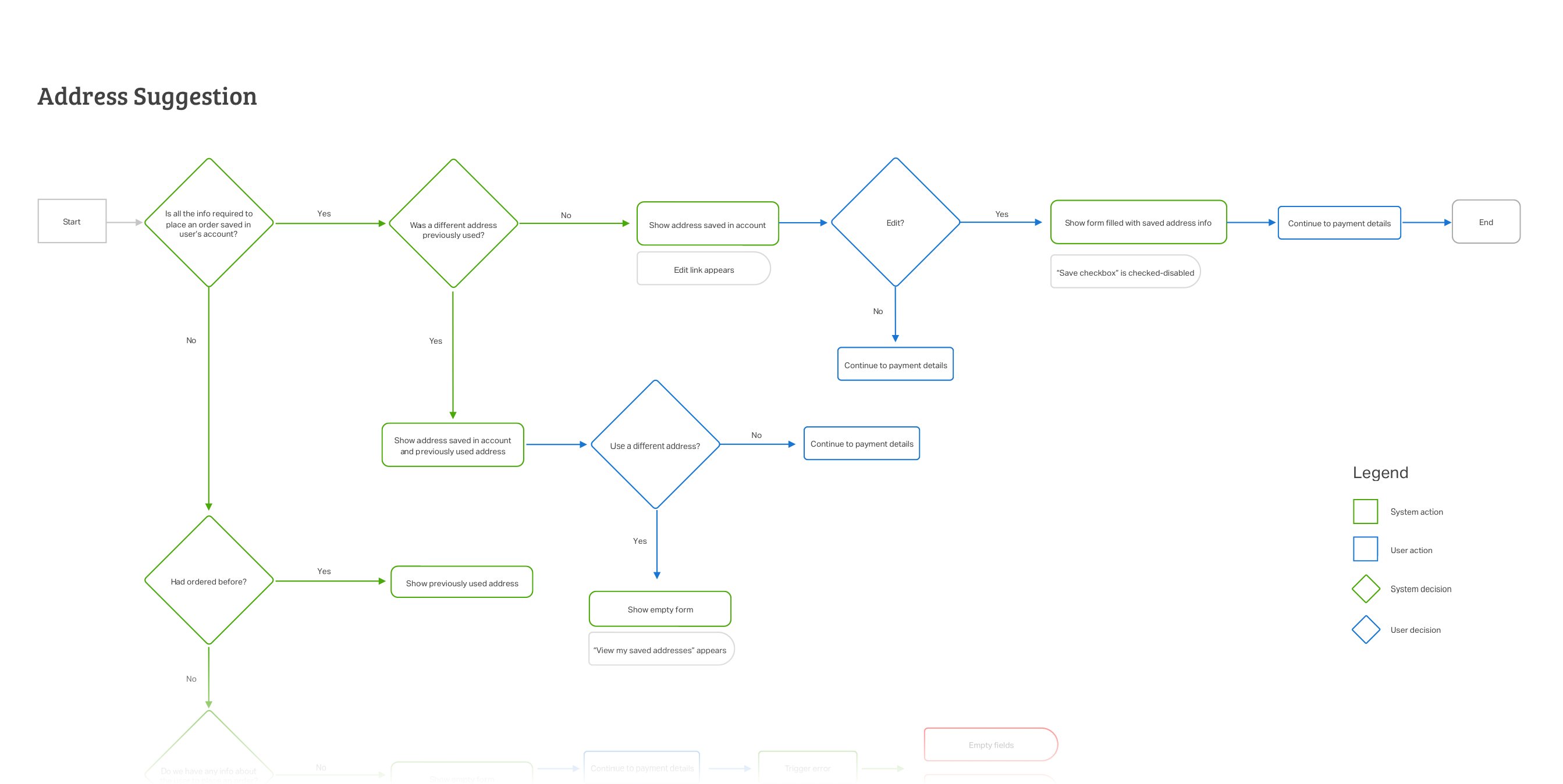
One biggest issues we found was that users needed to complete all 7 fields in order to enter their shipping address information every time! Which is very annoying and time consuming.
Initially, we thought on creating an address book so users could save many addresses, but this would increasing the scope substantially. So our next idea was to re-utilize some of the functionality we already had. The “Account Information” page, gave users the chance to save their personal address, but surprisingly, the stored addresses were not been used for anything at all, they had no purpose or value for the business.
Maybe we could pull those stored addresses to help returning users.
The next problem we faced was that very few users had ever visit their account page, let alone saved their addresses. At least, now we had to space for storage, but how can we get users to save them? Our initial solution was to let them enter it as usual in the checkout, but giving them the option to save it as their "account" address, that way it would be prompted for future orders.
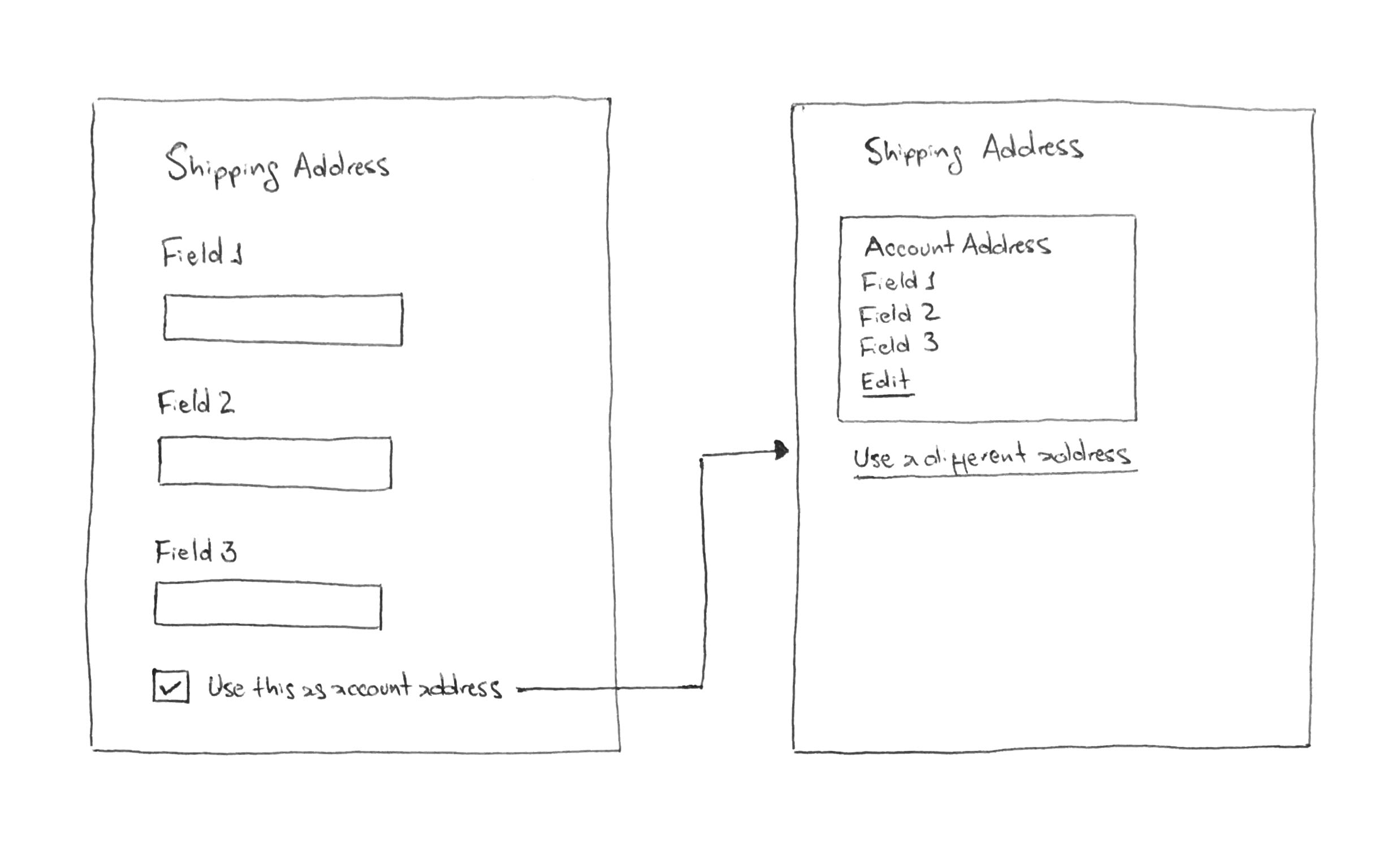
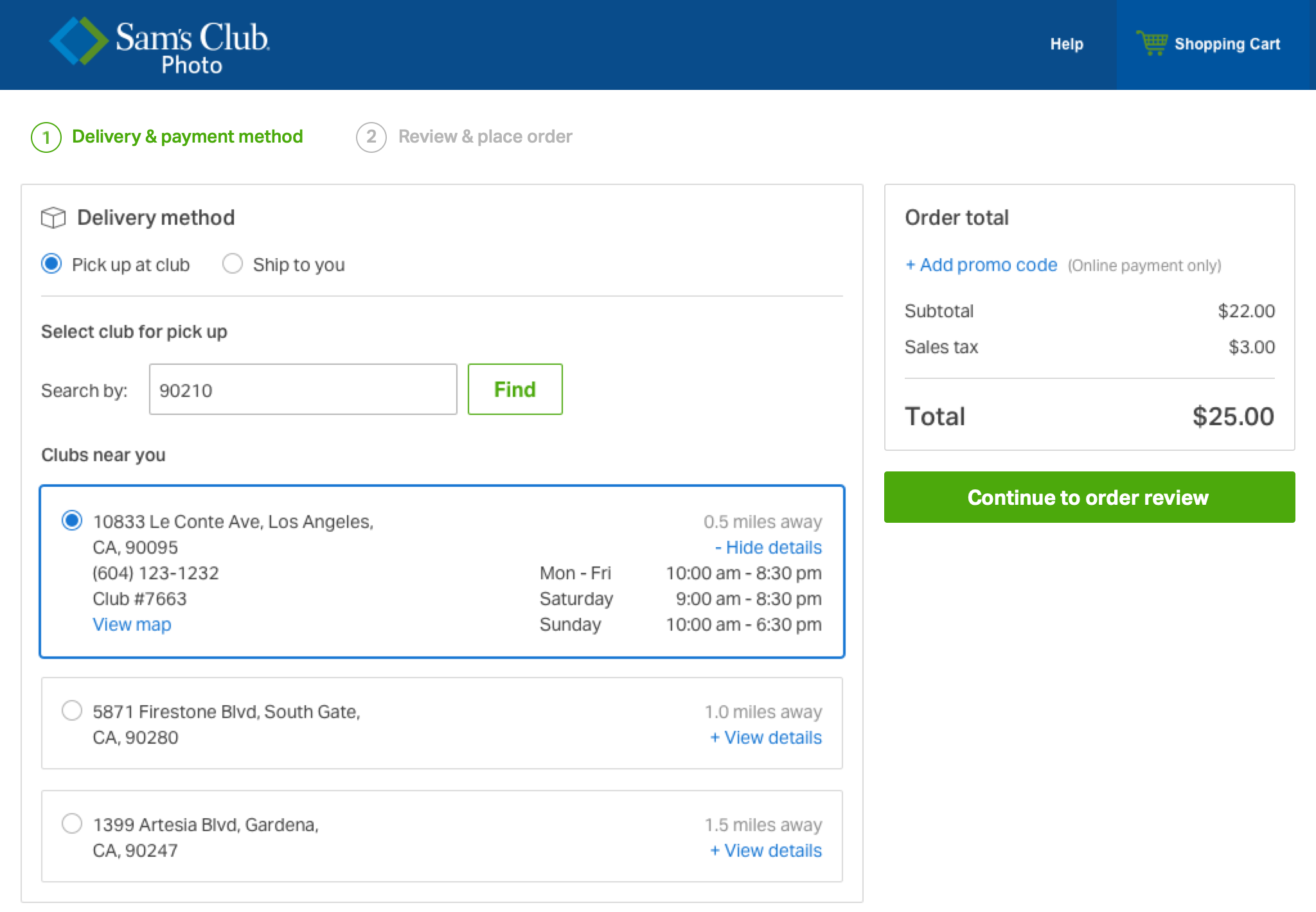
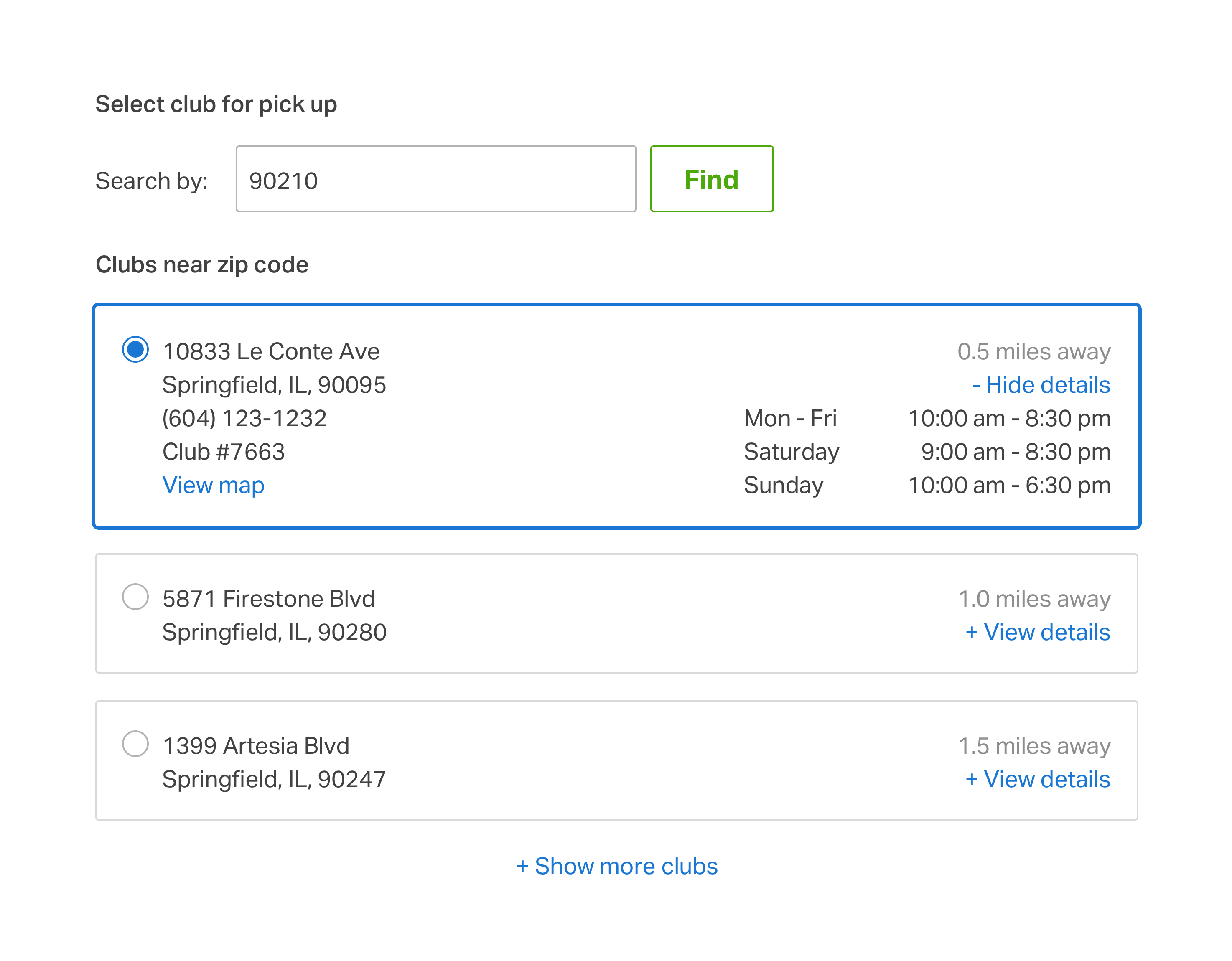
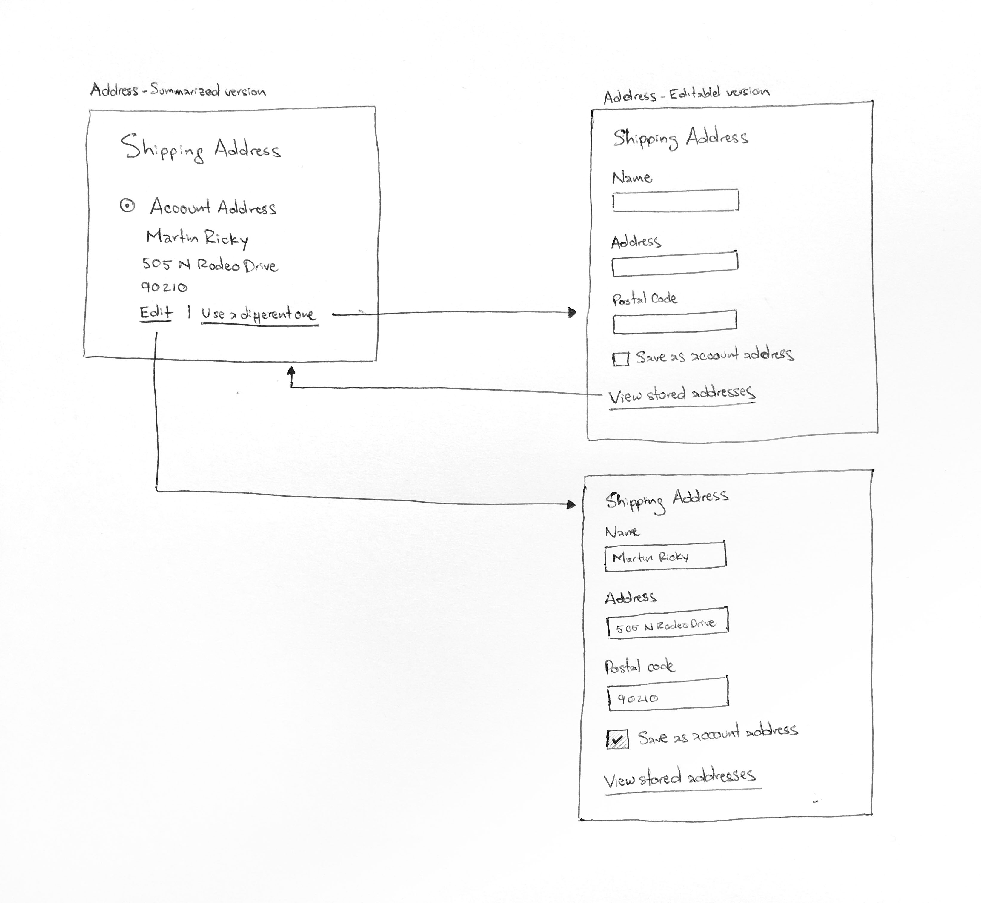
Saving account address within checkout
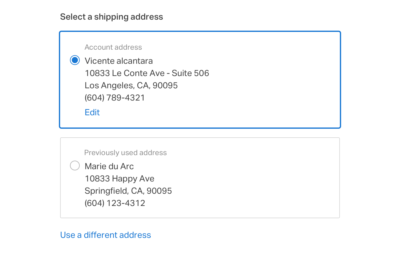
We also gave users the chance to edit their account address from within the checkout, as well as to use a complete different address if they wanted.
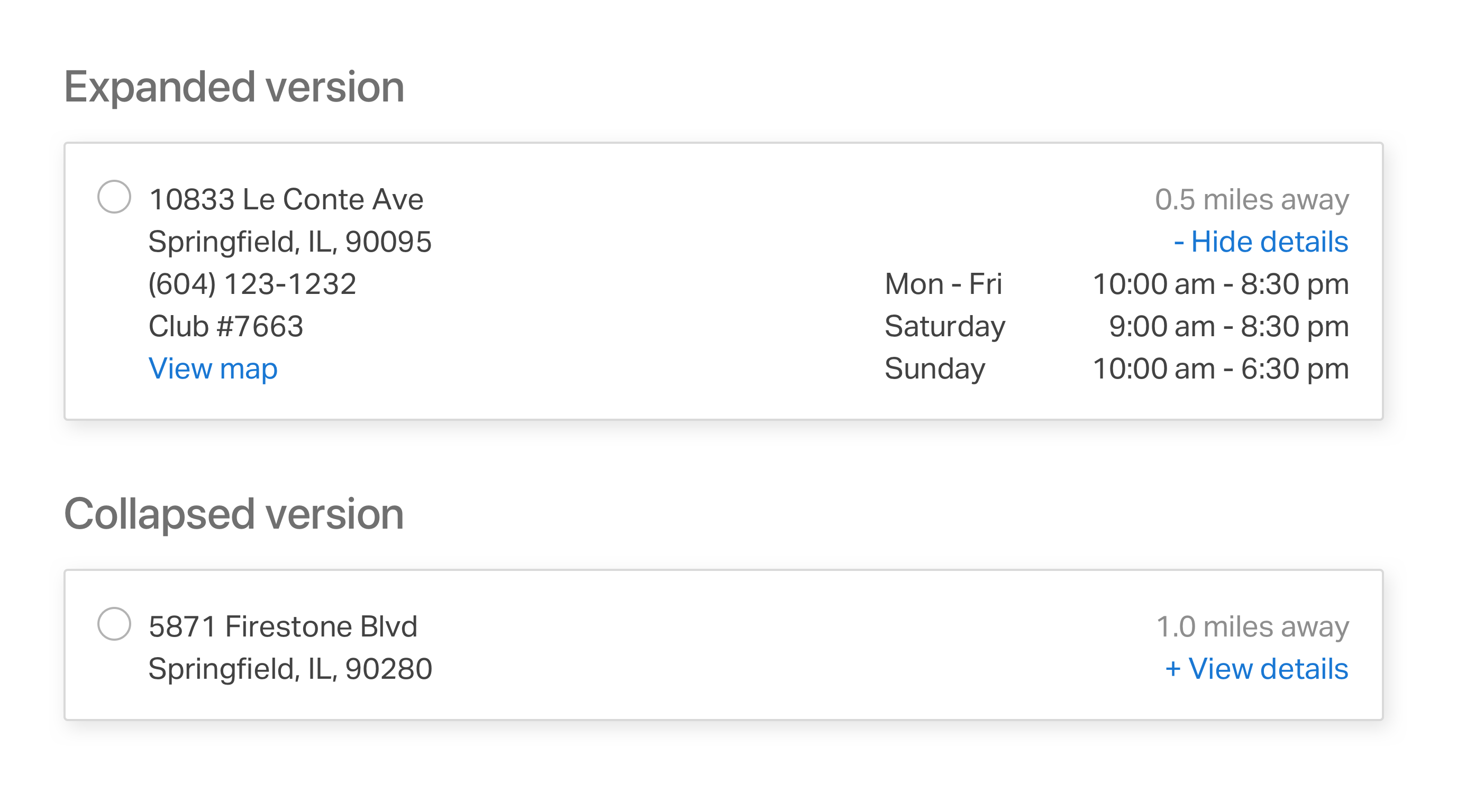
Saved address expanded functionality
Even if the address was not saved as the account address, it could help users to see their previously used address. And If the previously used address is the same account address, the system will show it only as “Account Address”.
Saving account address within checkout